Hi 1Feed users! I hope this update finds you well. The previous update before this was the big 1.0 release at the end of March. I intended to ship updates each month, but due to lots of schoolwork (this is my final year!), that never ended up happening.
Worry not though — 1Feed v1.1 is shipping today, and it brings a whole lot of awesome usability, design and performance improvements as well as lots of bug fixes! Read on to learn more.
Table of contents
Design improvements
The easiest way to show the essence of this redesign is probably to give you a before-and-after pic:
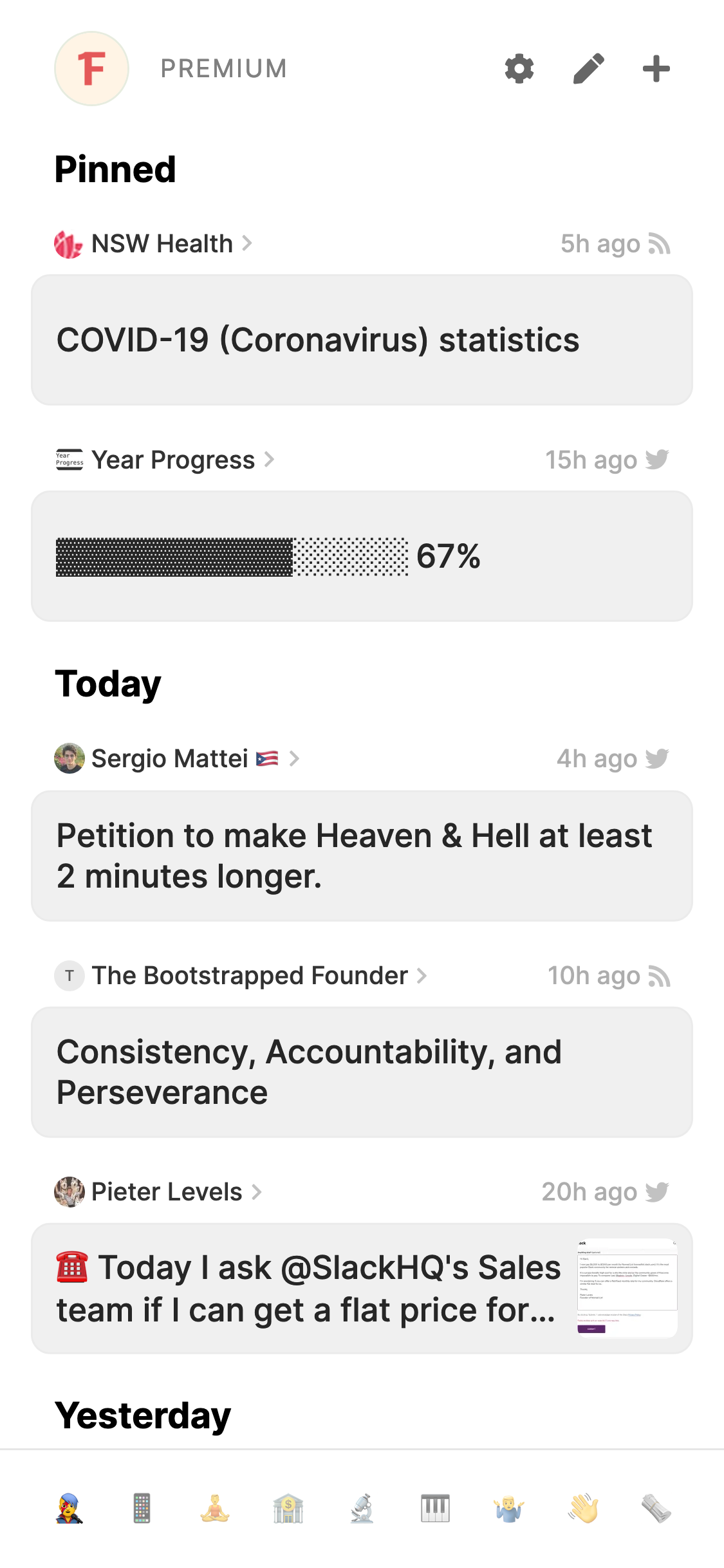
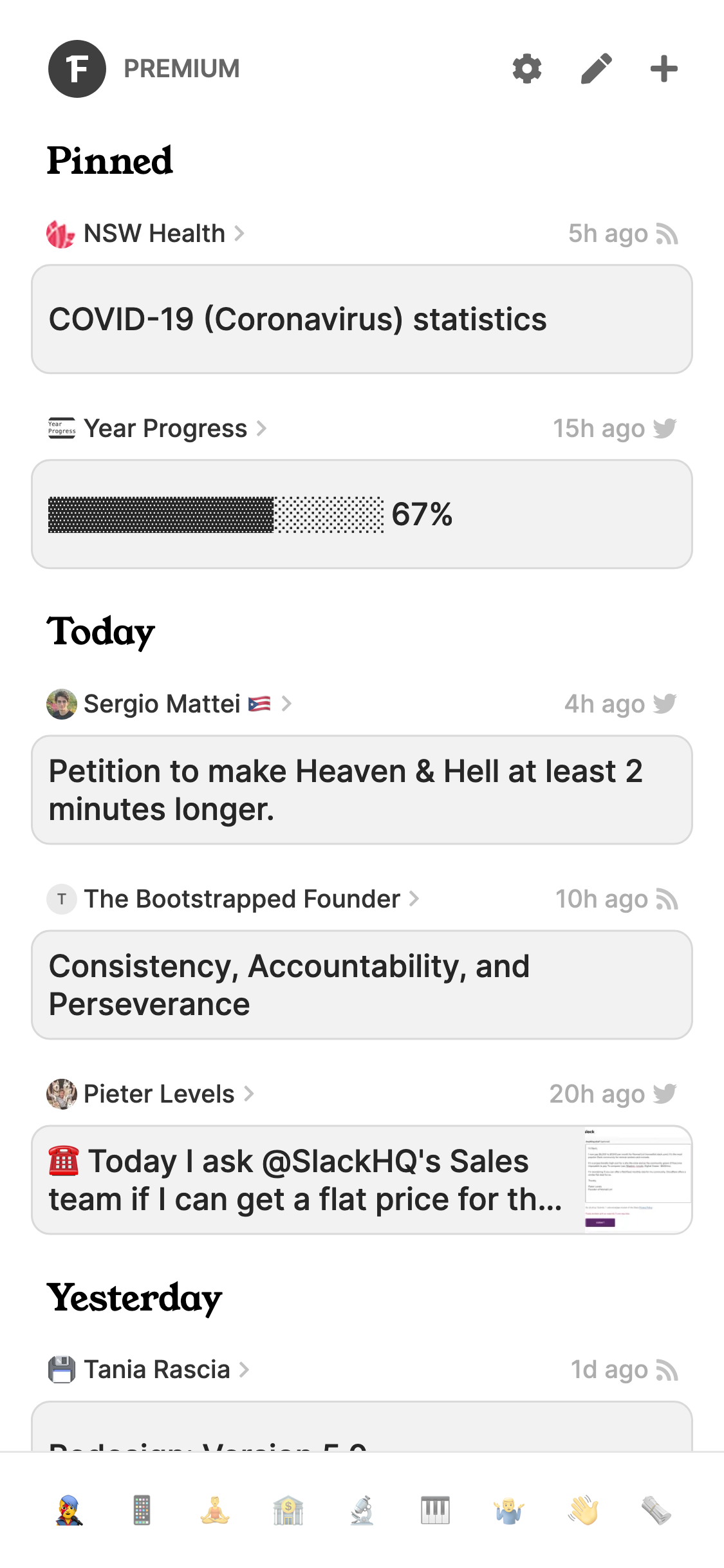
(before is on the left, after is on the right)
And I’ll walk you through some of the changes as well!
More compact interface
The first thing you’ll notice is that the interface is way more compact — while in the before pic, “Yesterday” is almost cut off at the bottom of the screen, in the after pic, we can even see half of the next entry down!
Adjusting the compactness of an interface can always be a point of contention, but I’ve made sure that it still feels very readable despite the compactness.
I reduced the font size slightly, and reduced the padding by a lot. But after using it for a few weeks, I don’t feel like it’s cramped, and in fact, it’s actually increased the readability — having more things on the screen at once reduces the need for scrolling as often, and the smaller gaps between entries makes it easier for your eyes scan for new content.
It may take a little bit of getting used to, but if after a week or so it still feels too compact for your liking, please email me! (my email address is at the top of the Settings page in the app)
Use of serif fonts
You may have noticed that the headings such as “Pinned”, “Today” and “Yesterday” are now in a serif font. For those of you who don’t know, a serif font is simply a font that has ‘caps’ at the ends of letters, similar to a font you’d find in a book.
That’s exactly why I made this change actually — I want to make reading your 1Feed feel as calm and cosy as sitting down to flip through a book, rather than an industrial-looking interface of people shouting at you from across the internet.
I may further this ‘book-ey’ feel in future releases, including (potentially) a sepia theme — let me know if that’s something you’re interested in!
This serif font is also used in a few other places in the app, such as page headings.
Improved contrast in light mode
If you have a keen eye, you might also have noticed the stronger borders around each item in the screenshot above. I’ve found that this stops everything from bleeding into each other in your brain, leading to an easier reading experience!
The changes will also improve card-type interfaces elsewhere in the app, as well as form input fields. This only affects the light theme, as the dark theme already had better contrast in comparison.
Less distracting logo
The logo in the app’s header has been made smaller and is now greyscale. I know the 1Feed logo is great and all, but does it really need to be chilling there in its beautiful popping brightly-coloured form every time you go to check your 1Feed?
This change makes 1Feed look less distracting and more calming — now the only colorful elements left in the interface are avatars and text with emojis.
A new website design
To match the app’s new calming and book-like feel, I’ve updated this website to match. The main changes include serif fonts, less distracting colours, and — possibly most excitingly — a dark mode!! 🎉
Now if your device is in dark mode, opening up the 1Feed website won’t make your eyes bleed.
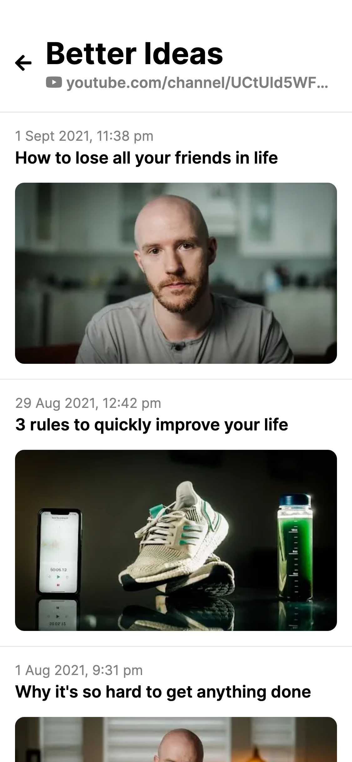
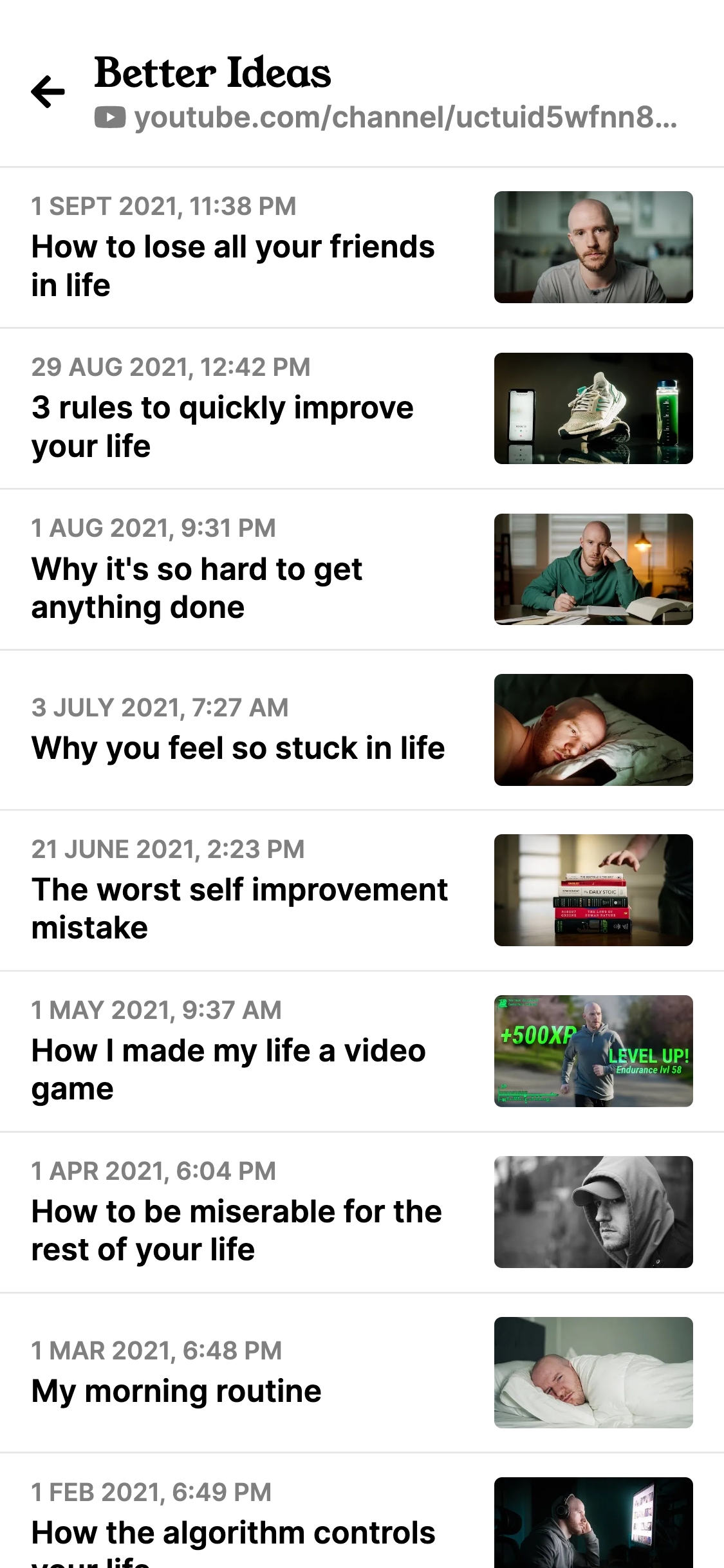
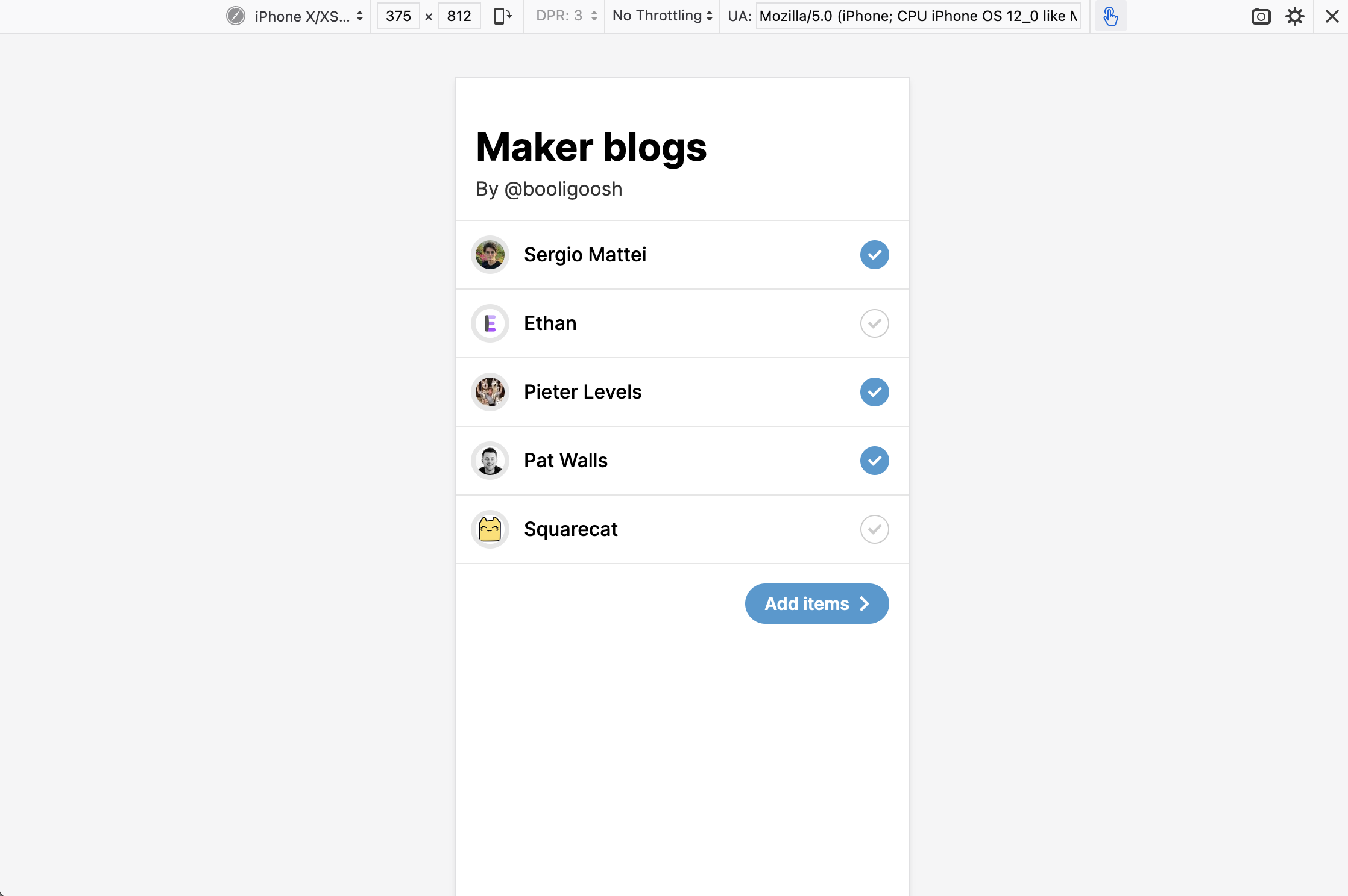
Improved feed items screen
The new feed items screen is way more compact, making it easier to see more feed items at once. This before-and-after should tell you all you need to know:
Improvements to the Add screen
Previously, adding items to your 1Feed via the browser extension or share menu on Android, you would get taken to your 1Feed after adding them. This isn’t ideal if you’re in the middle of something, and don’t want to get distracted by all the interesting things in there!
Now, after adding an item to your 1Feed from anywhere except pressing the “+” button in the 1Feed interface (eg. via the browser extension), you will see this page:
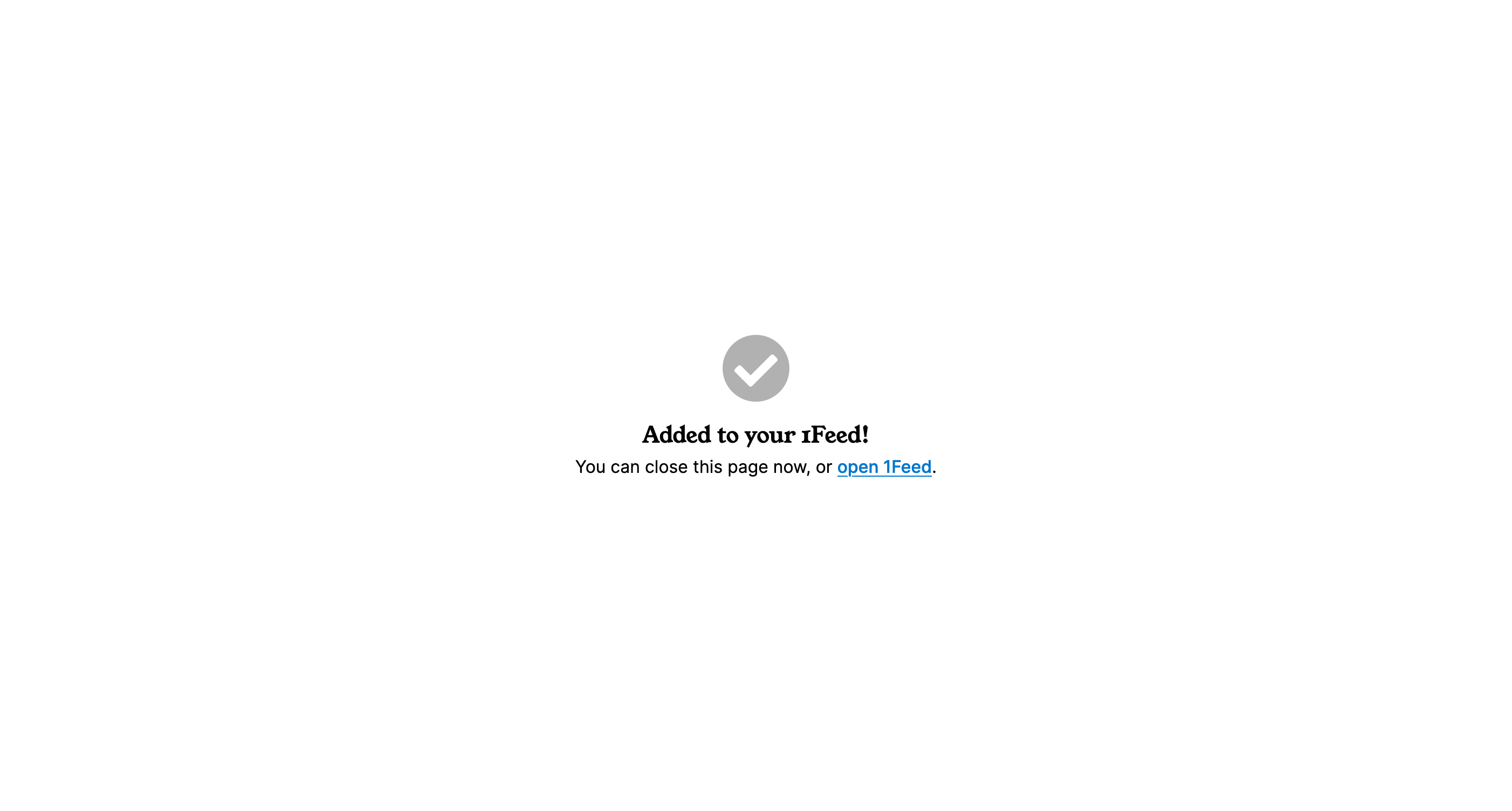
From there, you can make a choice whether you want to enter your 1Feed or simply close the page.
Performance improvements
I’ve made a lot of large performance improvements in the release, but here are a few:
- If you have lots of feed items, 1Feed should now feel much snappier
- The Add page will now load faster when navigated to from the browser extension or Android share menu
- When checking for new content, 1Feed will now only send the list of feed items if there are new ones, meaning it’ll use a lot less of your Wi-Fi / mobile data bandwidth!
Bug fixes
Obviously, as with any release, this one contains tons of bug fixes — too many to list them all! But hopefully you’ll find the 1Feed experience more smooth and error-free now. If you do happen to find any remaining ones though, let me know!
1Feed lists — not quite yet!
1Feed Lists is a way of sharing your favourite feed items with others and discovering interesting new sites to add to your 1Feed. I started working on it for this release, but the scope was much bigger than I had realised, and due to the lack of time I’ve had lately, I wasn’t able to get it done for this release. It will hopefully ship in next release though, so that’s something to look forward to!
And that’s a wrap
Thanks for being interested enough in 1Feed to read these release notes, and I hope you enjoy the new changes!
If you don’t, or if you just want to give some feedback or suggest an idea, feel free to contact me — my contact details are right at the top of the Settings page in the app!